Opera 65 Arrives With Better Tracker Blocker and a New Address Bar
- Opera 65 is an incremental update that brings small but meaningful improvements here and there.
- The browser’s brand new tracker blocker is now offering insightful information to the users.
- Version 65 also comes with a redesigned address bar and a new way to access and edit bookmarks.
Last month, we talked about Opera 64 introducing a whole new tracker blocker that promised to make our browsing both quicker and more private. With version 65, the popular browser is taking a chance to improve the tracker, as well as to deliver a new address bar that has been redesigned for your pleasure and convenience. Bookmarks can now be handled more comfortably, and history can be accessed more efficiently to quickly locate what you’re looking for. Of course, the newest version is also based on the latest available Chromium and all the security and bug-fixing goodies that come with it.
With the new and improved tracker blocker, users won’t just reap the benefits of speed, but they will also be able to see which trackers they are blocking as they browse the web. This provides insight to the user, which is very important in a field where we have to deal with thousands of little code snippets that try to track what we’re doing online. To enable this, you must switch the relevant toggle to the active position, and this will result in the appearance of a little blue shield right on the address bar. Clicking on it will give you more information about the trackers that are being blocked.
Source: Opera Blog
Opera still comes with a list of known tracker scripts that enables their identification and blocking, which is a system that is similar to how the browser’s ad blocking works. The result of this is an estimated average speed gain of about 20%. If coupled with the ad blocker, the total speed improvement reaches up to 76%. This depends on the number of ads and trackers that a website tries to load though. Users can still configure the blocker to exclude specific domains, as blocking trackers can sometimes have adverse effects on the displaying of content.
Source: Opera Blog
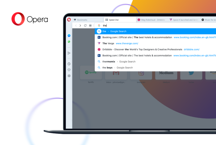
As for the new address bar design, the drop-down layout has been optimized to help with user searches, the search results are now displayed according to a logical and prioritizing categorization, and websites now appear with their logo. All in all, the purpose was to make the browsing experience faster, and these subtle changes go a long way in that direction. Finally, there’s a new bookmark sidebar panel that offers users a more straightforward way to access what they want and edit their bookmarks on the fly.
Are you using Opera, or do you prefer a different internet browser? Let us know in the comments down below, or on our socials, on Facebook and Twitter.


