Microsoft is Redesigning Skype Again After Recent Controversial Update
- With users unhappy about the latest Skype 8.0 update, Microsoft will be redesigning the service’s apps yet again.
- Microsoft revealed that many recent updates did not resonate with what most users wanted, which led the tech giant to redesign the apps yet again.
- The new update will focus on the core features that are popular amongst users and the redesign should be live by next quarter.
Microsoft sought to redesign Skype with version 8.0, but many users were unhappy with the redesign of the popular VOIP app. Many of the core features were redesigned and the new “Highlights” feature that was first introduced last year was not well received. The tech giant has decided to listen to user feedback and work on yet another redesign that will be in line with what the users want.
Image Courtesy: Skype
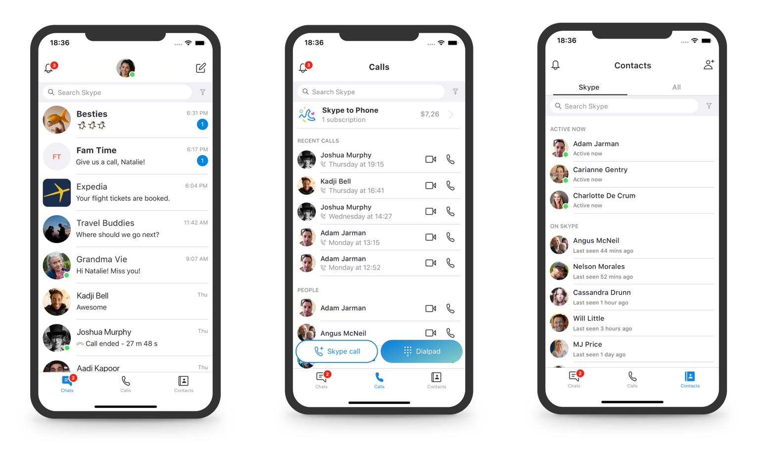
For mobile users, Microsoft wants to slim down the user interface and wants to make the app as easy to use as possible. The app will be toned down heavily for ease-of-use and the redesign will feature only three navigation buttons for accessing chat logs, calls, and contacts. Notifications will be grouped together in the top-left corner and the colors on the app will also be tweaked to reduce the contrast. Decorative elements will also be removed to allow for a cleaner visual experience similar to Google’s Material design.
Microsoft has set up a UserVoice website to collect feedback on all of the upcoming features and changes that are headed to the app. All of the new features will hit the beta version of the app soon and testers can use the UserVoice website to submit feedback. Skype was the go-to app for many but Microsoft’s VOIP app kept falling behind due to a lack of features and people moved on to services like Facetime, Messenger, WhatsApp and other popular services instead. The tech giant is trying to retake its market share with redesigns and long-awaited features to put Skype back on the map.
What do you think about the upcoming Skype redesign? Let us know in the comments below. Get instant updates on TechNadu’s Facebook page, or Twitter handle.


