Hulu is Working On A Brand New Landing Page And UI Tweaks
- Hulu is set to redesign its landing page to make it easier for users to find content.
- “Hulu Picks” is set to be redesigned to list content curated by Hulu staff.
- The streaming platform will also offer a two-week programming schedule at all times.
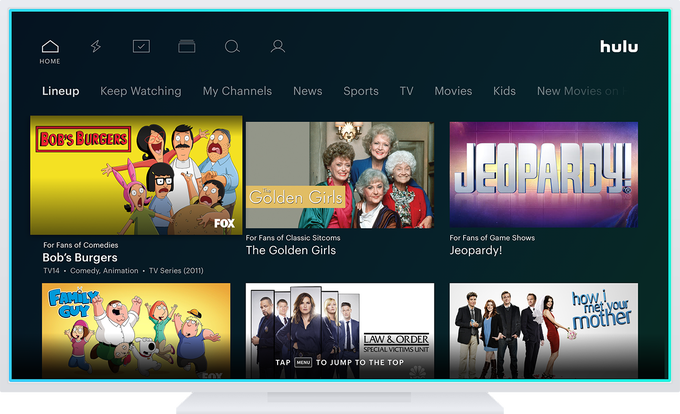
Streaming app Hulu is set to get a major design overhaul throughout 2019 to improve the user experience. While the app is extremely popular, the user interface feels quite dated, and navigation can be a bit of a hassle. The app’s current landing page “Lineup” will be replaced with something easier to use.
Image Courtesy of TechCrunch
With the current Hulu landing page being the go-to option for finding content, there is a lack of personalization in the Lineup menu that breaks the experience. Two new lists will be showcased in the new interface including a modified “Hulu Picks” and “Unwatched in My Stuff” as reported by TechCrunch.
Hulu Picks currently allows users to modify what kind of content they want to see and receive suggestions accordingly. Once the new update hits, it will not only suggest content based on a user’s settings but also include lists curated by Hulu’s staff. The “Unwatched in My Stuff” section will appear to remind you of shows that you have on your watch lists but miss out on. Users can manually mark content as “unwatched” as well.
A new “Details” button will be implemented that will help Hulu users get access to useful information like ratings, genre, release dates and more. Users will also be able to add shows to their “My Stuff” list from within the menu. The interface will keep adding new suggestions as you scroll down instead of showing a small number of recommendations like it currently does.
The Live TV menu is also being revamped which will allow users access to a two-week schedule. Currently, users are able to access a list of currently airing content and upcoming content only. Other changes include the addition of visual templates and other navigation tweaks that will be released in parts throughout 2019. With over 100 million installs globally, the platform continues to push out updates to keep its users happy.
What do you think about the changes coming to Hulu? Let us know in the comments below. Share your thoughts below or on our socials at Facebook and Twitter.

