Chrome’s New UI Becomes the Only Option Now, and Users are Very Angry
- The new UI of Chrome has caused great dissatisfaction in hundreds of users.
- Google has made it mandatory, and many channel their wrath to the developers through social media.
- People are threatening to use Firefox instead, while many of them downgrade to a previous version of Chrome.
There is no possible way for developers and interface designers of an application to have every single person of their user-base absolutely pleased with their work. There has never been a method to produce such results, and there will never be, so having some complaints about how things look in an application is only natural really. When the UI is renewed, however, then the power of habit kicks in, so, even more, are complaining about the changes which are characterized as anything from merely annoying to overly catastrophic.
This is what happened with the UI refresh that Chrome got back in September with version 69, but people were not too vocal about their objection to the changes since they could always use the “classic” UI instead. This option has now been retracted, and so everyone is forced to use the new UI, causing a social media blizzard over the past few days.
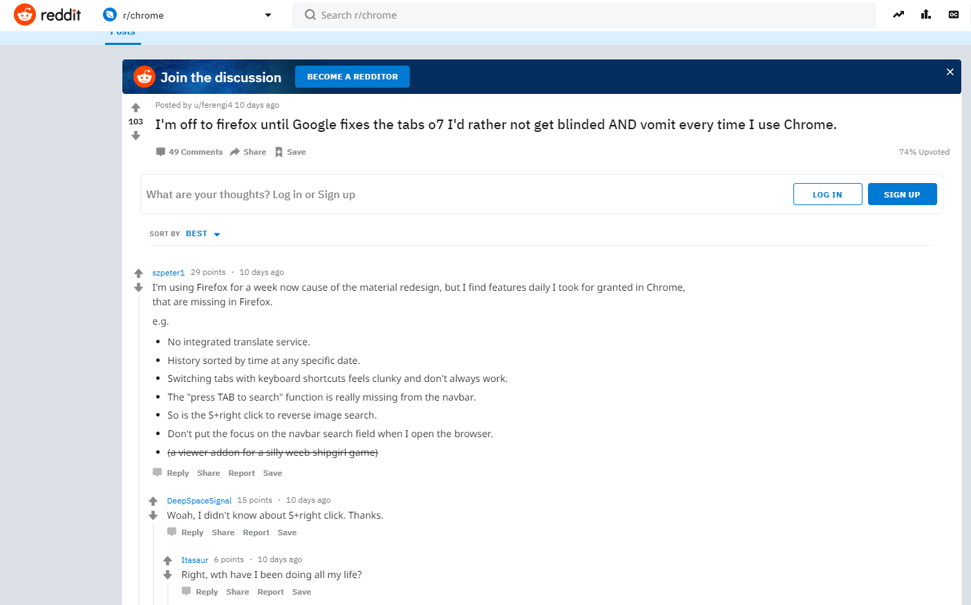
Just a sample of the hundreds of Reddit rants
Many Chrome users have gone on Twitter and Reddit to complain about this coercion from Google’s side, asking for possible ways to get the old UI back, cursing the designers of the new UI, threatening to leave for Firefox until the “tabs design is fixed”, and a lot more.
Chrome got rid of the flag that kept the old tab ui. 🙁 Now all my tabs look ugly
— jackson @ irl (@minecoder) December 18, 2018
One thing that a lot chose to do was to downgrade to a previous Chrome version, to which Chrome developers responded as follows through the engineer Peter Kasting: "Please don't do this. As a Chrome dev, we would really rather you use another browser than try to lock yourself on an old version of Chrome. There are serious consequences to this, and much like choosing not to be vaccinated, the choice affects other people besides just you. The easiest thing to do would be to just stay on Chrome," he said. "With nearly all users we've talked to who've done this, they don't mind the new UI after using it for a couple weeks, it's just the initial adaptation that's a shock.”
However, users are justifiably complaining that adaptation is not the key this time. The new UI of Chrome broke their ability to mute tabs individually while finding the tab that they are looking for became more difficult. All this makes Chrome more inconvenient when used on desktop systems and laptops, as the developers seemed to have focused on the mobile interface much more than they should have. Google is not planning to bring the old UI back, not even as an option, however, listening to the user feedback and implementing targeted corrections and additions here and there will be a solid way through which to mitigate the user leaks to an antagonistic browser.
What do you think of the new Chrome UI? Let us know in the comments below, and also share your thoughts on our Facebook and Twitter platforms.


