Bootstrap Alternatives 2019: Advanced CSS Frameworks for Developers
Bootstrap has been around for years—helping developers churn out splendid front-end websites. Over the years, it has managed its reputation as the most popular front-end framework. At its praise, we would like to mention that Bootstrap is the second most starred project on GitHub. It has well over 100 thousand stars under its belt. However, Bootstrap may not be the right solution for all types of websites, especially simple ones. At times, we don’t need a full-fledged framework as the project doesn’t require 10s of building blocks. It is a plain waste of resources and time. These are the occasions, one must consider different CSS Framework platforms.
In this article, we will list the top Bootstrap Alternatives suitable for all your developmental requirements.
1. Foundation
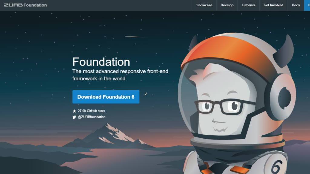
Foundation is a powerful framework for building rapid production code and prototypes on any kind of device. On its website, it mentions that the platform is the most advanced responsive front-end framework, which is not far from the truth. The platform is famous for its responsive design philosophy, which translates to simultaneous designing for multiple screens. On the platform, styles are consciously undeveloped to encourage the variations between the sites created using Foundation. It also has built-in form validation and comes with RTL support.
Foundation greatly supports mobile. In fact, it is among the very first platform that adopted the mobile-first philosophy. The platform also features a Back lock grid that allows designers to put order into their cluttered space. This, undeniably, is the best alternative to Bootstrap. Period.
2. Skeleton
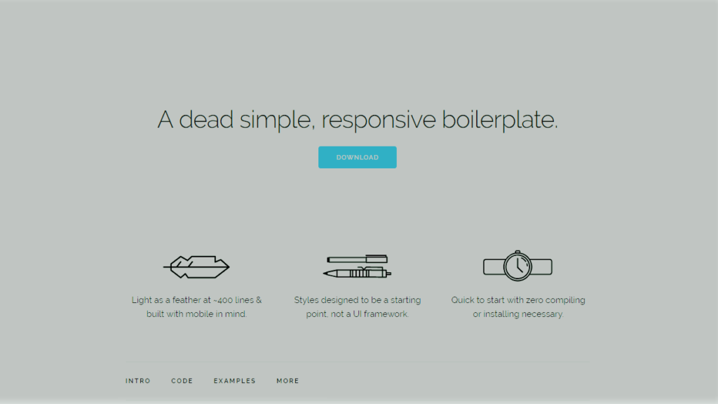
Last year, Skeleton has been relaunched with its new face—a total redesign from the ground up. This redesigning didn’t change the fact that the platform is still as light as its previous version. On its website, the platform is called ‘a dead simple and responsive boilerplate.’
This boilerplate is made up of just about 400 lines and is specifically designed with mobile devices in mind. It is to be noted that the Skeleton is not a fully-featured framework, but a mere starting point to start website designing. You should only prefer the Skeleton if you are considering a small project. It is only capable of styling a handful of standard HTML elements. It also features a grid. Often, these features are enough to get started. To illustrate the point, the Skeleton’s own website is built on its own platform. Check it out. For its simplicity and lightweight, we give Skeleton the second spot on our list.
3. Materialize
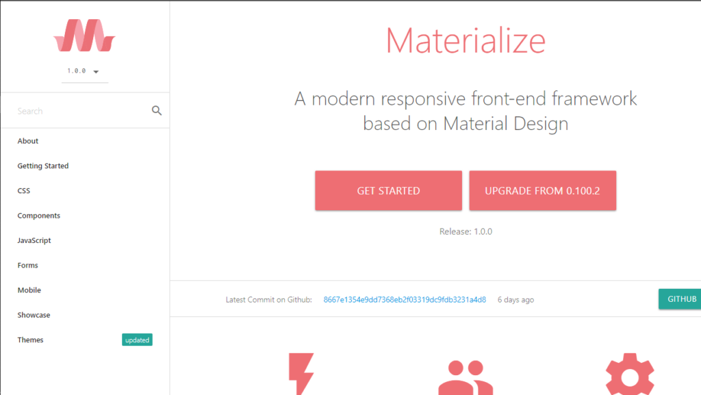
Materialize has developed its front-end framework based on the material design principles by Google. The platform is primarily designed for modern sites. When we tested the platform, we found it very responsive. It incredibly integrates the traditional methods of designing with the latest innovations and technology.
Materialize is a fascinating way to incorporate a touch of material designing to your projects. If you are a new developer, you can use this without the hassle of complicated codes. The platform does most of the heavy lifting to provide you with the custom components of a premium design. It also ensures that the animations across your website stays smooth, and helps in providing a unified user experience. The platform provides detailed documentation with examples to help new users get started. Adding to that, their feedback system is great. We highly recommend this framework to all the newbie developers.
4. Pure
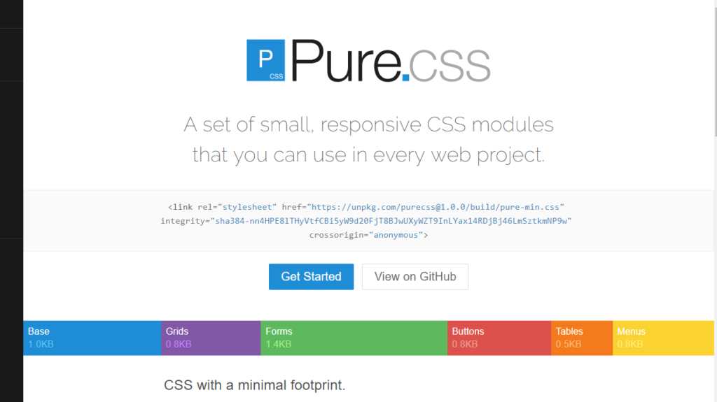
Pure is a clustered set of CSS modules, which might not sound convincing but it does well what is it designed for. The platform defines itself as a set of small responsive CSS modules which can be used in every project. Pure is incredibly tiny for a framework. Its entire set is sized at 3.8 KB. The platform is primarily designed with mobile devices in mind, which is why the coding is kept tight, where every line is carefully considered.
The platform also encourages to use its subsets, if possible, which will make your projects even lighter. Pure encourages you to design your project on the top of it, and the platform allows it by keeping itself minimal. This unopinionated Bootstrap alternative is one of the best lightweight frameworks for all your projects.
5. UIKit
UIKit is a lightweight and modular front-end framework for powerful development and responsive web interfaces. The platform features a Pro version which multiplies your developmental possibilities. It gives you a theme and page builder for both Joomla and WordPress. UIKit allows you to customize every aspect of its framework and arranges your content on an intuitive and comprehensive interface. It supports drag and drop page feature for faster development and generates a tailored UIKit markup.
UIKit also features pre-built styles and layouts—hundreds of them. So, the entire development can be done with taps and edits. You can also create your own style with readily available UIKit components; like accordions, button, and cards.
6. Cardinal
Cardinal CSS framework is designed for high scalability, maintenance, and performance. Its mobile-first approach allows front-end developers to scale and build. The platform also helps it in maintaining CSS for responsive user interfaces, applications, and websites. Cardinal made to our list because it consciously omits several aesthetic design decisions which save its framework from bogging down. This gives you more control over your project and leaves the creativity up to you.
Platform’s mobile-first CSS is designed to use less preprocessor. It features sensible global styles, useful mixins, and variables. It also has a grid system to include styles for common UI object like tables, forms, and buttons.
7. Semantic UI
Semantic UI acknowledges that the user interface is the language of the web. One of the things that stood out while testing it was its well-documented instructions and elaborate examples of source codes. No doubt that the platform is easy to use and only loads the components that you need. However, we found a couple of problems with it. The classes on the platform don’t work together and it requires Jquery for Javascript functionality.
The platform has a futuristic design and looks incredible on the websites. It also has several official implementations of semantic UI for many popular libraries. It’s adaptable and responsive design makes it a perfect alternative to Bootstrap.
8. Bulma
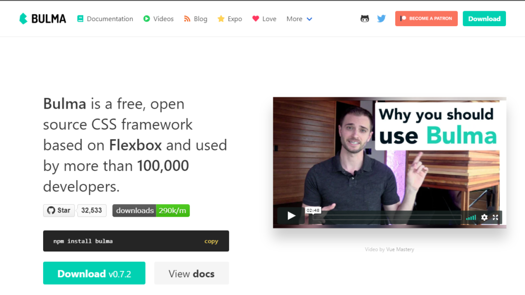
Bulma is a Flexbox based CSS framework which is used by more than a hundred thousand developers. A few years ago when it first came to the market with its full-fledged flexbox grid, it became an instant hit. The platform also features a massive list of components that are helpful for coding a wide range of websites. Bulma deserves a mention in our list, not just for its incredible features but also for its looks. It is simply the most beautiful framework we tested. Result? It produces really nice looking websites with a very simple set of tasks.
The drawback of this platform is that it has no JavaScript. However, you can write your own JavaScript or use Jquery for it. We highly recommend this platform to developers who like frequent updates and hassle-free workflow.
9. Groundwork
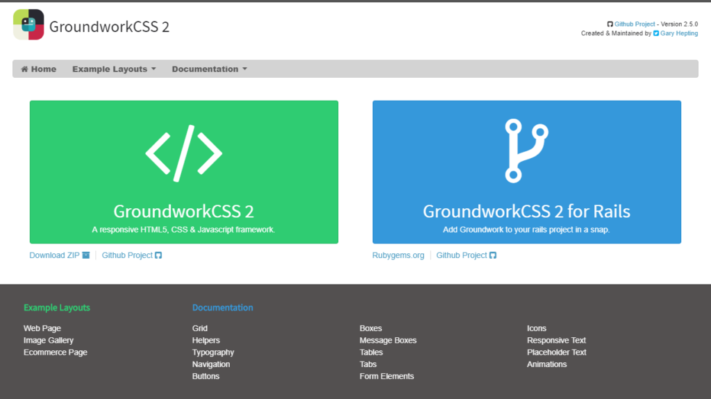
Groundwork is another lightweight framework for developers. The platform is a responsive framework which allows developers the flexibility to create scalable applications. Groundwork features an adaptive fluid grid system which ensures that your design fits all screen sizes; phones, notebooks, TVs—you name it. The platform is highly customizable and allows you to put your own style. You can also bolt your coding on it for additional functionalities.
The platform is available in two versions; Groundwork CSS 2, which is a JavaScript framework, and GroundworkCSS2 for Rails, which is specifically designed for rails project.
10. Mueller
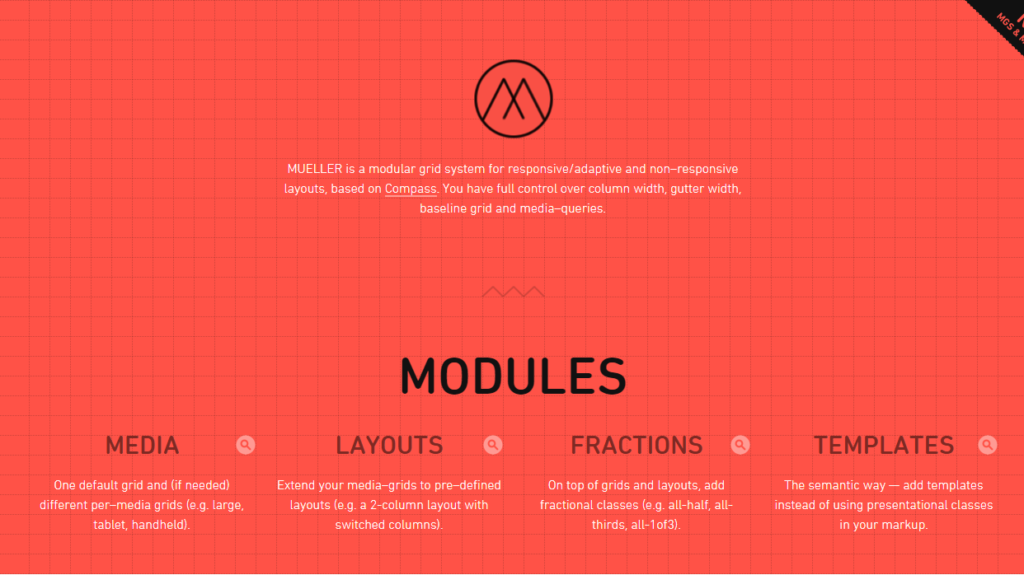
Mueller is a modular responsive grid system based on Sass and Compass. The platform allows you to build the grid in a couple of ways. You can either add classes straight to the HTML or use the grid function - (grid()). The platform’s grid can be combined with the Masonry Javascript library to produce a layout similar to Pinterest.
Mueller proves to be a great alternative in terms of creating responsive and adaptive layouts. The platform allows plenty of customizations and gives you complete access over column width, baseline grid, media queries, and gutter width.
These 2019 alternatives of Bootstrap have their own set of pros and cons. We have also briefly explained the prime reasons we picked them. Hopefully, this list of Bootstrap alternatives will help you find a CSS Framework which is both powerful and flexible enough for all your requirements.
Do you agree with our list, or do you think we have missed one of your CSS Framework? Do let us know in the comments. Also, to get instant tech updates, Follow TechNadu’s Facebook page, and Twitter handle.

