Google Shares Early Material Theming Concepts for Android P
- Google revealed Material Themes at I/O 2018 after various sources revealed aspects of the design.
- During the Google keynotes, first-party apps were showcased by the tech giant.
- Google is also revealing partner studies to showcase concepts that partner companies are working on and how other developers can adopt the design.
Google released partner studies to showcase elements of its new Google Material Theming for Android P, which was unveiled at Google I/O 2018. It will allow third parties to design more distinct apps following Google’s Material design. Each of the apps showcased display refined UI elements that were revealed in the recently concluded Google event.
The new Material Design for Android P and beyond was being speculated on by analysts based on web apps that were being updated by Google over the past few weeks. First party apps have already been updated to include the new design elements and features, and Google is revealing the partner studies apps can help app developers greatly. It will lead to more consistently designed apps for the platform.
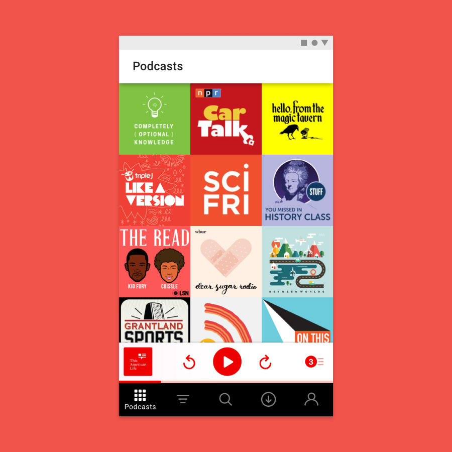
Pocket Casts
Image Courtesy of Google
The theme of the Pocket Casts concept was motion and the devs swapped out the navigation drawer for a bar at the bottom. The app continues to include a minimized player above the new navigation menu. The app is more feature rich and includes new controls for rewind/forward.
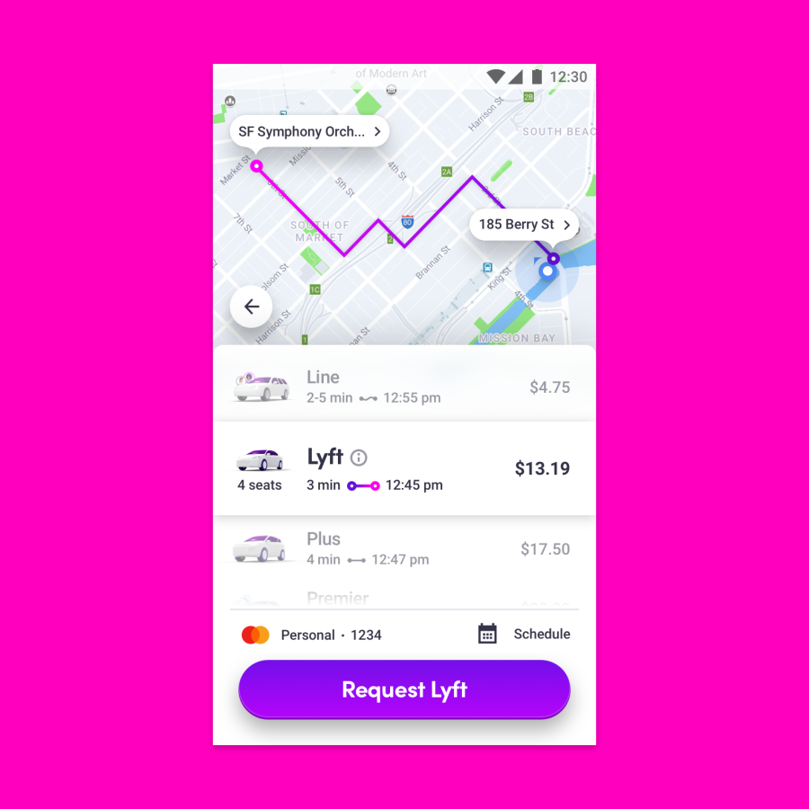
Lyft
Image Courtesy of Google
One of the most notable changes in the Lyft app includes the extended FAB, which has already been implemented in apps like Google Tasks. The added width and prominence help users books ride more easily. The button will match the text depending on the type of rides booked by users.
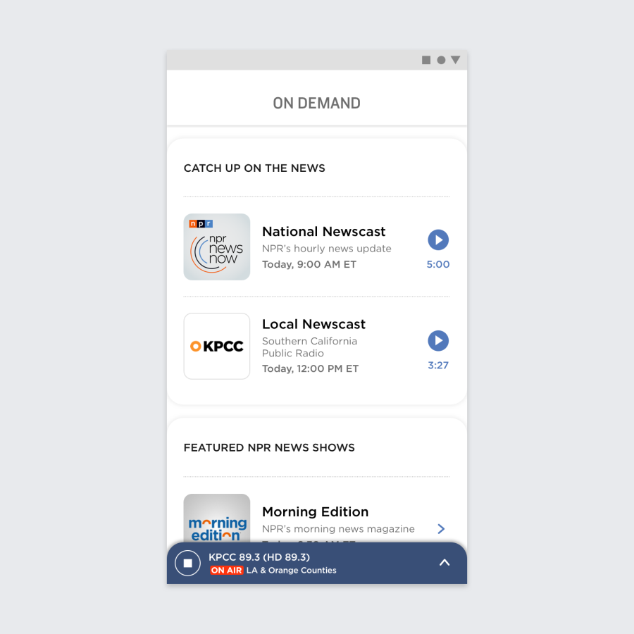
NPR
Image Courtesy of Google
The radio app makes use of Google Cards in Android P to keep its content organized. The app now has a white background and includes three cards for a list of programs on the air, with a third card to act as an audio player. The cards can be swiped to reveal the controls for the player.
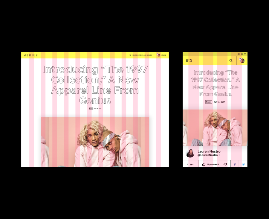
Genius
Image Courtesy of Google
The Genius app is the only one that showcases Material themes applied responsively. We get to see a desktop view alongside the default Android UI. The Material UI has been applied to the web app for Desktop already.
Zappos
Zappos took advantage of Android P’s Backdrop design elements to make use of contextual pop-ups. The app has been built to show contextual and actionable content that users can interact with to make searches easier and more convenient.

