Did Google Accidentally Suggest that Android P Might Use Gestures Similar to iPhone X?
For quite some time, Google has been running tests on a navigation bar for Android P. Many followers have suggested that it looks like the UI and new gestures on the iPhone X. The new navigation bar was released accidentally in one of Google’s Android Developers Blog posts.
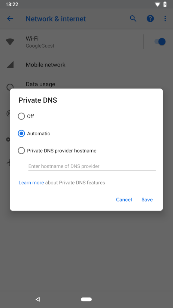
While the navigation bar was quickly and swiftly cropped out of the screenshot, the cached copy of the post reveals the full picture of the screenshot including the navigation bar. Going by the shot, Google seems to have shown the door to the multitasking button. There is a change in the center home button too, which now looks pill-shaped and far smaller.
In a report by 9to5google, it was highlighted that the new navigation bar being tested by Google is very similar to the one on iPhone X. The swipe up gesture is said to open up the multitasking pane. It is not clear if the new pill-shaped home button is the same that was spotted in a leaked image of Moto X5 sometime back.
Image Source: Android Developers Blog
Some argue that the purported home button is just an identifier like the iPhone X, used to swipe up for added controls. Google seems to be including the back button controls also in Android P (follow link to the developer preview of Android P).
As of now, Google is only testing the navigation bar. Moreover, the company has a history of testing different navigation bars and never implementing them on shipped phones. A report by The Verge suggests that Google is still supporting screen notches like iPhone X with the new and updated Android P. An enhanced navigation bar powered by human gestures will give Android developers a broader spectrum to make better use of displays without bezels.
Google’s I/O 2018 will start on the May 8th in Mountain View. Both Android users and developers will be expecting a lot more on Android P in the conference.


